
Project Requirement Analysis
We begin by thoroughly understanding your existing website structure, business objectives, and audience behavior to create a strategic responsive conversion plan.
Breathe new life into your existing websites with Figma2Html’s expert HTML to Responsive conversion services.
We ensure your website not only looks stunning but performs flawlessly across all devices, delivering unmatched user experience and engagement.


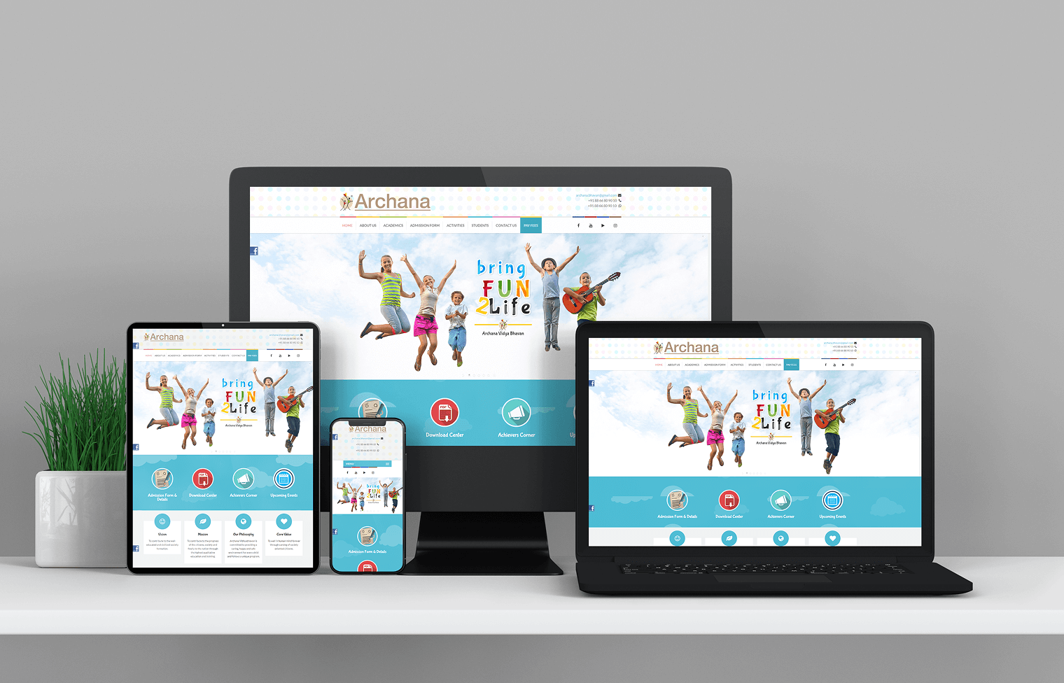
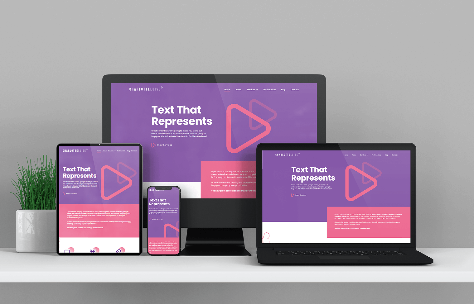
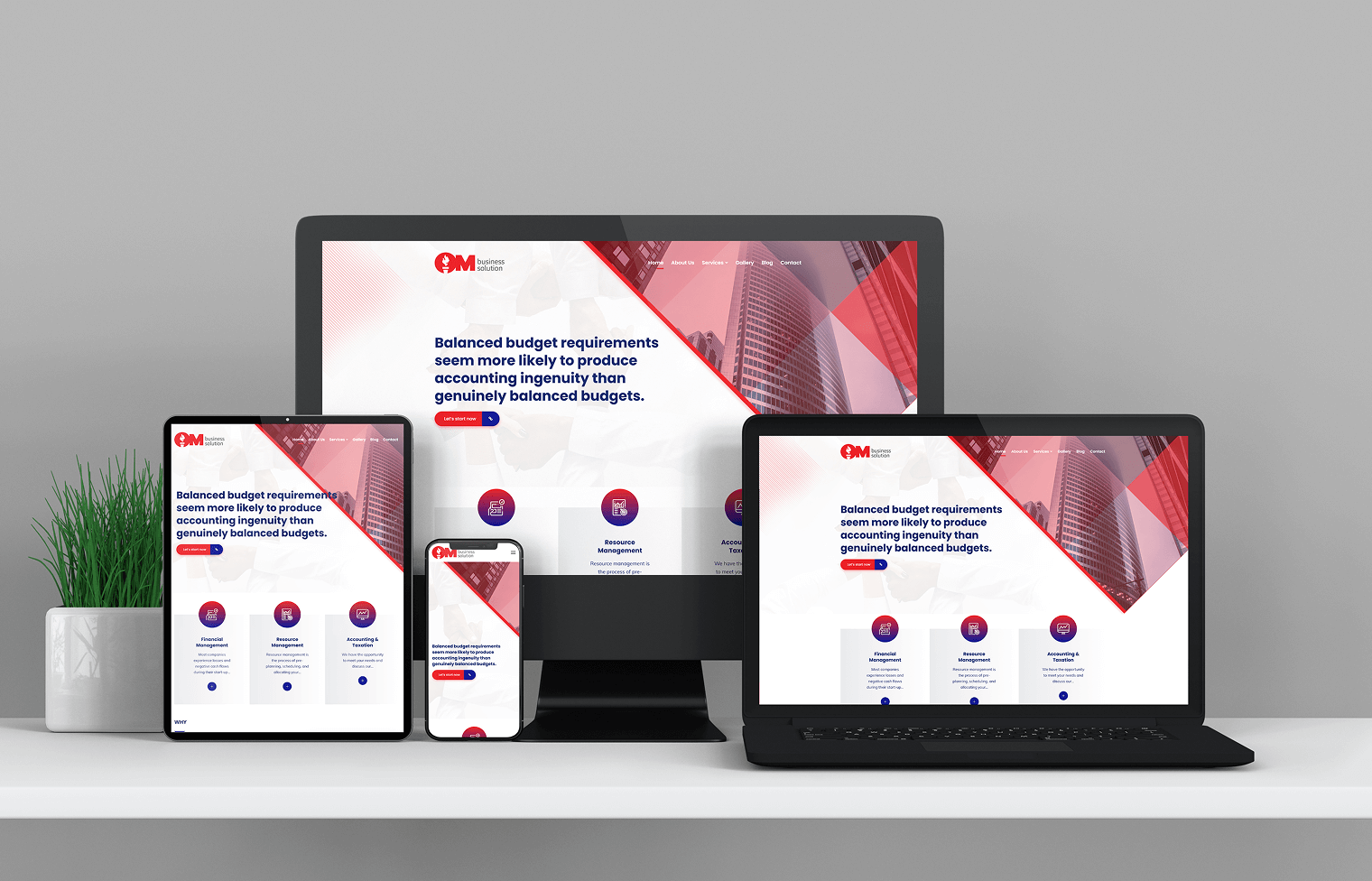
At Figma2Html, we specialize in converting your static HTML websites into fully responsive, adaptive, and mobile-friendly designs. In today’s digital-first world, your website must seamlessly adapt to desktops, tablets, and smartphones. Our seasoned developers ensure that your site’s layout, functionality, and visual appeal remain consistent across all screen sizes.
Our focus is not just on responsiveness but also on performance optimization, SEO compatibility, and visual excellence. Whether it’s an old HTML site or a fresh design prototype, we transform it into a modern, responsive masterpiece that drives engagement and conversions.
Choosing Figma2Html means partnering with a team that understands the nuances of HTML Responsive Web Design, ensuring that every pixel adjusts flawlessly, every button responds instantly, and every user enjoys a premium browsing experience.
A responsive HTML design ensures your website delivers a seamless and engaging experience across all devices, from smartphones to large desktops. By optimizing layouts and enhancing performance, it significantly boosts user satisfaction, SEO rankings, and overall business conversions.

Your website will look and function perfectly on mobiles, tablets, laptops, and desktops, providing a consistent user experience everywhere.

Responsive design aligns with Google’s mobile-first indexing, giving your website a better chance to rank higher in search results.

Optimized responsive layouts reduce load times, ensuring smooth navigation and increased user engagement.

A user-friendly, mobile-optimized website enhances customer trust, leading to more inquiries, sales, and overall business success.
Your website will look and function perfectly on mobiles, tablets, laptops, and desktops, providing a consistent user experience everywhere.
Responsive design aligns with Google’s mobile-first indexing, giving your website a better chance to rank higher in search results.
Optimized responsive layouts reduce load times, ensuring smooth navigation and increased user engagement.
A user-friendly, mobile-optimized website enhances customer trust, leading to more inquiries, sales, and overall business success.
A structured approach that guarantees excellence.
1
We begin by thoroughly understanding your existing website structure, business objectives, and audience behavior to create a strategic responsive conversion plan.

2
A deep dive into your HTML code to identify challenges, outdated practices, and opportunities for improvement while maintaining design consistency.

3
We design responsive wireframes showcasing how your site will adapt across devices, ensuring an intuitive and engaging user interface.

4
Using cutting-edge technologies like CSS3 Flexbox, Grid, and Bootstrap, we transform your static website into a dynamic, responsive platform.

5
Rigorous testing on multiple devices, browsers, and resolutions to ensure flawless rendering, functionality, and performance optimization.

6
Post-approval, we deploy your responsive website live and offer ongoing support to keep it updated and running smoothly.
Delivering tailored solutions with precision and expertise.

Our team consists of highly skilled front-end developers who specialize in crafting responsive designs that combine functionality and visual appeal.

We tailor our services to your unique needs, ensuring your responsive website reflects your brand identity and business goals.

Every line of code is written with SEO best practices, ensuring higher visibility and better search engine rankings.

From project initiation to post-launch support, we ensure transparent communication and timely assistance at every step.
Our team consists of highly skilled front-end developers who specialize in crafting responsive designs that combine functionality and visual appeal.
We tailor our services to your unique needs, ensuring your responsive website reflects your brand identity and business goals.
Every line of code is written with SEO best practices, ensuring higher visibility and better search engine rankings.
From project initiation to post-launch support, we ensure transparent communication and timely assistance at every step.

Figma to ReactJS Conversion

Figma to React Native App Development

Figma to GatsbyJS Website Design

Figma to Next.js Integration Services

Custom React Component Development

Responsive ReactJS Web Design
Harnessing the latest tools and frameworks to deliver pixel-perfect responsive websites.
HTML5
CSS3

Bootstrap

Media Queries

SASS / SCSS
JavaScript
jQuery

GTmetrix
Projects Delivered
Happy Clients
Years of Expertise
Client Satisfaction

Let’s future-proof your digital presence with Figma2Html’s expert HTML to Responsive services. Enhance user experience, improve SEO, and stay ahead of the competition with a fully responsive website tailored to your business.
Explore our full range of web solutions.
It is the process of transforming a static HTML website into a dynamic, mobile-friendly layout that adjusts seamlessly to different screen sizes and devices.
Responsive design enhances user experience, improves SEO rankings, and ensures your website looks great on all devices, which is essential in today’s mobile-first world.
Depending on the complexity, the conversion typically takes between 7-14 working days after project approval.
Yes, we ensure pixel-perfect conversion where your original design aesthetics are preserved while making the layout responsive.
We utilize a combination of modern frameworks like Bootstrap, CSS3 Flexbox, and Grid to ensure scalability and responsiveness.
Absolutely. Optimizing performance and load speed is an integral part of our HTML Responsive Web Design service.
Costs vary based on project complexity. Contact us for a personalized quote based on your requirements.